Why Your Backsplash Is the Most Important Decision You’ll Make
You’ve spent weeks, maybe months, agonizing over cabinet door styles and the exact shade of “off-white” for your kitchen island. You’ve finally landed on the perfect setup from 10 Percent Cabinetry, and you think the hard part is over. Then, you look at that blank vertical space between the counter and the upper cabinets. It’s about 18 inches of empty wall that could either turn your kitchen into a Pinterest-worthy masterpiece or leave it looking like a generic showroom floor. Most people treat the backsplash as an afterthought—a practical necessity to keep grease off the drywall. But if you talk to any high-end designer, they’ll tell you that a modern kitchen backsplash is actually the “connective tissue” of the room. It’s the visual bridge that ties your aesthetic together, and frankly? It’s where you get to show some actual personality without committing to a neon green refrigerator.
The kitchen is no longer just a place to boil pasta; it’s the social hub of the house. Because of this shift, the materials we put on our walls have to work harder than ever. They need to be durable, sure, but they also need to reflect light, provide texture, and complement the lines of your 10 Percent Cabinetry installation. When we talk about kitchen backsplash ideas, we aren’t just talking about choosing a color. We’re talking about scale, orientation, and the way a material responds to the morning sun hitting your breakfast bar. It’s about the difference between a kitchen that looks “fine” and one that feels curated.
Think about it this way: if your cabinets are the suit of your kitchen, the backsplash is the silk tie or the statement necklace. It’s the focal point at eye level. When guests walk into your home, they don’t immediately look at your floorboards or your toe kicks. Their eyes land right in that middle zone—the backsplash. If you go too safe, the room feels flat. If you go too wild without a plan, it feels chaotic. Finding that “Goldilocks” zone of design is what separates a standard kitchen renovation from a professional-grade transformation. And let’s be honest, we’ve all seen those kitchens where the tile just feels… off. Usually, it’s because the homeowner didn’t consider how the tile pattern would interact with the grain of their wood or the finish of their hardware.
Modern design has moved past the era of beige-on-beige. We are seeing a massive resurgence in tactile materials and bold layouts that challenge the traditional “stretcher bond” brick pattern we’ve seen for decades. People are getting braver. They’re realizing that because the backsplash is a relatively small surface area compared to the floor or the walls, they can afford to take a bit more of a risk. You can use a higher-end material like a marble backsplash or an intricate mosaic because you don’t need a thousand square feet of it. It’s the perfect place to splurge while keeping the rest of the project on a realistic budget. That’s the secret sauce of a smart remodel.
At 10 Percent Cabinetry, we’ve seen how the right backdrop can make a modest cabinet set look like a custom five-figure installation. It’s all about context. If you pair a sleek, minimalist cabinet with a rough, textured zellige tile, you create a tension between “modern” and “handmade” that feels incredibly sophisticated. If you pair that same cabinet with a flat, glossy subway tile, it might look a bit sterile. This guide is meant to help you navigate those nuances. We aren’t just going to list “blue tiles” or “white tiles.” We’re going to dig into how specific shapes, materials, and installation methods can fundamentally change the “vibe” of your home.
Are you looking for a kitchen that feels calm and Zen-like, or do you want something that energizes you while you’re brewing your first cup of coffee? Your choice in a tile backsplash design dictates that mood. It’s the difference between a space that feels like a laboratory and a space that feels like a home. Over the next few sections, we’ll break down the specific trends that are actually worth your time and money—not just the ones that look good in a magazine but are a nightmare to clean. We’re talking real-world functionality met with high-end aesthetics. So, let’s get into the nitty-gritty of how to elevate your contemporary kitchen design.
Rethinking Subway and Geometric Tiles
If you mention the words “subway tile” to a room full of interior designers, you’ll likely get a few eye-rolls. Why? Because for the last fifteen years, it has been the default setting for every “safe” kitchen in America. But here’s the thing: subway tile is a classic for a reason. It’s affordable, it’s clean, and it fits almost any 10 Percent Cabinetry style. The problem isn’t the tile itself; it’s the way we’ve been using it. In 2024 and beyond, a subway tile backsplash is no longer about the 3×6 white ceramic brick in a standard offset pattern. We are seeing a complete overhaul in how these staples are laid out, and the results are honestly refreshing.
The Vertical Revolution
One of the simplest yet most effective modern backsplash ideas we recommend is flipping the orientation. Instead of laying tiles horizontally, try stacking them vertically. This is called a vertical stack bond. What does this do for your kitchen? It draws the eye upward, making your ceilings feel significantly taller. If you have a kitchen with standard eight-foot ceilings, a vertical stack can create an illusion of grandeur that a horizontal pattern simply can’t touch. It feels architectural, structured, and decidedly modern. It’s a favorite for 10 Percent Cabinetry clients who want a “mid-century modern” or “Scandi-minimalist” look. And if you use a tile with a slight variation in color—something like a “hand-pressed” look—the vertical lines create a beautiful, shimmering rhythm across the wall.
Geometric Sophistication: Beyond the Square
If the linear look of subway tile isn’t your speed, it’s time to look at geometric kitchen tiles. We aren’t just talking about basic hexagons anymore (though a large-format hex in a matte finish is still a solid choice). We’re seeing a rise in Moroccan-inspired shapes, “picket” tiles, and even triangles. These shapes provide a rhythmic complexity that acts as a piece of art. For example, a picket tile—which is essentially a stretched-out hexagon that looks like a fence picket—offers a elongated, elegant feel. It’s less “retro” than a standard hex and more “architectural.”
When you go geometric, the grout becomes a design element in its own right. Most people pick a grout that matches the tile to hide the lines, but in a contemporary kitchen design, contrasting grout can be the star of the show. Imagine a charcoal-colored hexagonal tile with a crisp white grout line. Suddenly, the pattern pops, creating a honeycomb effect that adds incredible depth. It’s a bold move, but when paired with the clean lines of 10 Percent Cabinetry, it anchors the room in a way that feels intentional and high-end. Just a tip from the field: if you go with a complex geometric pattern, keep your countertop simple. You don’t want a “busy” stone fighting with a “busy” tile pattern. Let one of them be the lead singer and the other the backup dancer.
The Herringbone Twist
Then there’s the herringbone. It’s technically a rectangular tile, but the 45-degree angle layout turns it into a geometric powerhouse. A herringbone pattern is sophisticated, classic, and adds a sense of movement. It’s particularly effective in larger kitchens where you have a long stretch of wall. It breaks up the monotony and prevents the space from looking too “blocky.” While it’s a bit more labor-intensive to install (you’ll need to order about 15% extra tile for all those corner cuts), the visual payoff is massive. It’s the kind of detail that makes people ask, “Who was your designer?”
Ultimately, the “new rules” of pattern are all about breaking symmetry. Whether it’s a vertical stack, a chevron, or a Moroccan fish scale, the goal is to create a surface that has life. Your 10 Percent Cabinetry setup provides the perfect canvas for these patterns to shine. Don’t be afraid to step away from the standard brick layout. After all, you’re not building a subway station; you’re building a home that should reflect your specific taste and the way you live.
Slabs, Glass, and the Luxury of Texture
While the pattern is how you arrange the pieces, the material is the “soul” of the backsplash. In recent years, we’ve moved away from just thinking about ceramic or porcelain. Today’s homeowners are looking for materials that offer a sense of permanence and luxury. This is where the tile backsplash design conversation shifts from “what looks good” to “what feels premium.” If you’ve invested in high-quality 10 Percent Cabinetry, you want your materials to match that level of craftsmanship.
The Seamless Slab: The Ultimate Minimalist Flex
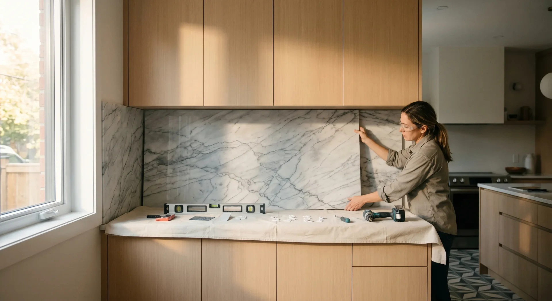
If you really want to make a statement, stop looking at tiles altogether. The “slab backsplash” is currently the gold standard for high-end kitchen renovation. This involves taking the same material as your countertop—usually a marble backsplash or a durable quartz—and running it all the way up the wall to the underside of the cabinets (or even to the ceiling). The result? A completely seamless, unbroken visual field. There are no grout lines to scrub, no patterns to distract the eye, and the natural veining of the stone becomes a giant piece of organic art.
Why does this move the needle so much? It’s about the “uninterrupted flow.” In a modern kitchen, clutter is the enemy. By removing grout lines, you create a surface that is incredibly easy to clean and visually calming. If you use a stone with dramatic veining, like a Calacatta marble, you can “bookmatch” the slabs so the veins continue perfectly from the counter up the wall. It’s expensive, yes, but it’s arguably the most impactful thing you can do for the “luxury” feel of your kitchen. It turns the cooking area into a focal point that feels more like a high-end furniture piece than a utilitarian workspace.
Reflective Surfaces: Glass and Metallics
For those dealing with smaller kitchens or spaces that don’t get much natural light, glass and metallic materials are game-changers. A back-painted glass backsplash—where a solid sheet of glass is painted on the reverse side—offers a sleek, glossy finish that reflects light like a mirror. It creates a sense of depth and “airiness” that opaque materials just can’t replicate. It’s incredibly easy to wipe down (no grout!), making it a practical choice for heavy-duty cooks.
Metallic tiles, on the other hand, bring an industrial or “glam” edge to 10 Percent Cabinetry. We’re seeing stainless steel tiles, copper mosaics, and even “aged” brass finishes. These materials react to the under-cabinet lighting, creating a warm glow in the evening and a bright, energetic feel during the day. If you have matte black cabinetry, a touch of brushed gold or brass in the backsplash can prevent the kitchen from feeling too dark or “flat.” It’s that pop of light that brings the whole design to life.
The Importance of Texture: Zellige and Hand-Clipped Stone
On the flip side of the “perfectly smooth” slab trend is the rise of high-texture tiles. Zellige tiles—handmade Moroccan clay tiles—are incredibly popular right now for a reason. Every single tile is slightly different. Some have chipped edges, some have varied thickness, and the glaze isn’t perfectly uniform. When you put them all together, you get a surface that looks “alive.” It has a soul and a history that machine-made tiles lack. When paired with the precision-engineered lines of 10 Percent Cabinetry, that organic texture creates a “perfectly imperfect” balance. It softens the room and makes it feel lived-in and cozy rather than just a “house for sale” staging project.
Whether you choose the monolithic power of a marble slab or the rhythmic texture of handmade clay, the material you choose will dictate how the light moves through your kitchen. It’s about more than just color; it’s about the tactile experience of the room. You’re going to be looking at this wall every single morning while you wait for the kettle to boil. Choose a material that you actually enjoy looking at—one that has depth, character, and the durability to stand up to a decade of splashes and spills.
Making Your Backsplash Vision a Reality
Selecting a stunning tile is only half the battle; the real magic—and the potential for major headaches—lies in the execution. When we talk about a modern kitchen backsplash, it’s not just a decorative strip behind the stove. It’s a functional barrier that has to survive steam, grease, and the occasional blender mishap. At 10 Percent Cabinetry, we often see homeowners fall in love with a particular marble or glass finish without considering how it will actually play with their electrical outlets or cabinet underlighting. Let’s break down the practicalities that turn a good idea into a flawless installation.
The “Outlet Problem” and How to Solve It
Nothing ruins the sleek flow of a tile backsplash design quite like a series of plastic white outlet covers right in the middle of a beautiful pattern. If you’re going for a high-end look, you have a few options. The most seamless choice is “under-cabinet power strips.” These are tucked up against the bottom of your 10 Percent Cabinetry wall units, keeping the backsplash surface entirely uninterrupted. If that’s not an option for your local building code, consider matching your outlet covers to your tile. Don’t settle for standard white if you’ve installed dark charcoal or brass-toned tiles. It sounds like a small detail, but it’s exactly what separates a DIY-looking project from a professional renovation.
Height Matters: The Ceiling-High Trend
Standard practice used to be stopping the backsplash right at the bottom of the upper cabinets. But honestly? That often feels truncated in a truly contemporary home. One of the most effective kitchen backsplash ideas we’re seeing lately involves taking the tile all the way to the ceiling, especially behind the range or around a window. This creates a vertical focal point that makes the room feel taller and more expansive. When you pair this with minimalist shelving from 10 Percent Cabinetry, the tile becomes the “wallpaper” of the kitchen, adding texture and depth without cluttering the visual field.
The Grout Choice: Your Secret Weapon
Grout is the unsung hero of any tile installation. Most people treat it as an afterthought, but it’s actually a primary design tool. Want your subway tile backsplash to look classic? Use a matching white grout. Want it to look industrial and edgy? Go with a high-contrast dark gray. But there’s a practical side, too. In high-splash zones (looking at you, stovetop), choosing an epoxy-based grout is a game-changer. It’s non-porous, meaning it won’t soak up tomato sauce or oil, saving you hours of scrubbing with a toothbrush later. It’s these small, unsexy decisions that ensure your kitchen stays looking like a showroom for years to come.
Consider the transition where your backsplash meets the countertop. A bead of silicone caulk is necessary to allow for the natural expansion and contraction of your home. However, matching that caulk to your grout color—not your countertop—usually results in a much cleaner, more intentional line. It’s these tiny nuances that we prioritize at 10 Percent Cabinetry because we know that when the details are right, the whole room feels “expensive,” regardless of the actual budget.
Why Materials Matter More Than Ever
The world of modern kitchen backsplash design is currently undergoing a massive shift. We’re moving away from the “safe” choices of the last decade and into an era of bold experimentation. But here’s the catch: a trend is only worth following if it actually serves your lifestyle. I’ve seen too many people choose a high-maintenance natural stone because it looked great on Instagram, only to regret it six months later when they realize they can’t use acidic cleaners on it. At 10 Percent Cabinetry, we believe the best design is the one that looks as good in year five as it did on day one.
The Slab vs. Tile Debate
One of the biggest shifts in contemporary kitchen design is the move toward “solid slab” backsplashes. Instead of individual tiles, homeowners are using a single, continuous sheet of material—usually the same stone as their countertop. Why? Because grout lines, no matter how well-done, add visual noise. A marble backsplash that runs seamlessly from the counter up the wall creates a sense of luxury that is hard to beat. It’s minimalist, it’s incredibly easy to clean, and it highlights the natural veining of the stone. However, it’s also a significant investment. If you’re working with a tighter budget, you can achieve a similar “slab look” using large-format porcelain tiles, which offer the same aesthetic at a fraction of the cost and weight.
The Myth of the “Timeless” Backsplash
Every client asks the same thing: “Is this going to look dated in ten years?” Here’s the hard truth—almost everything looks “dated” eventually. The goal shouldn’t be to avoid trends altogether; it should be to choose a trend that resonates with the architecture of your home and your personal style. For example, geometric kitchen tiles are incredibly popular right now. While some might call them a fad, they actually draw on mid-century modern principles that have been around for seventy years. When paired with the clean lines of 10 Percent Cabinetry, a hexagon or chevron pattern doesn’t feel like a temporary whim; it feels like a deliberate architectural choice.
Lighting: The Element You’re Forgetting
You can spend $50 a square foot on the most exquisite handmade tiles, but if your lighting is wrong, it’s all for naught. Backsplashes are vertical surfaces, which means they are highly susceptible to “shadowing” from upper cabinets. This is why we always recommend integrated LED task lighting for any 10 Percent Cabinetry installation. But go a step further: consider how the finish of your tile interacts with that light. A high-gloss tile will reflect light back into the room, making a dark kitchen feel much brighter. A matte or “zellige” style tile, with its slight imperfections, will catch the light at different angles, creating a beautiful, organic shimmer. If you have a kitchen with limited natural light, go for reflection. If you have a bright, airy space, you can afford to play with moody, matte textures that absorb light and add drama.
The industry is also seeing a resurgence in “warm” metals. Brass and copper backsplashes, or tiles with metallic glints, are replacing the cold stainless steel looks of the early 2000s. These materials age and develop a patina over time, which adds a layer of “soul” to a modern kitchen. It’s about creating a space that feels lived-in and curated, not just “new.”
Choosing Your Signature Look
Wrapping up a kitchen renovation can feel like a marathon. By the time you reach the backsplash phase, you’ve likely made a thousand decisions about floor plans, appliances, and sink depths. It’s tempting to just pick something “neutral” and call it a day. But I’d argue that the backsplash is actually the most important stylistic decision you’ll make. It sits at eye level. It’s what you see when you’re prepping dinner or pouring your first cup of coffee. It’s the bridge between your 10 Percent Cabinetry and the rest of your home’s personality.
When you look at current backsplash tile trends, the overarching theme is “personalization.” We are seeing a departure from the “white kitchen on white kitchen” look. People are finally feeling brave enough to use color—deep forest greens, navy blues, or even terracottas. These colors, when used in a subway tile backsplash with a modern layout (like a vertical stack), create a look that is fresh and unique. Don’t be afraid to let your backsplash be the “star” of the show while your cabinets play the supporting role. The balance of textures—perhaps a smooth cabinet finish from 10 Percent Cabinetry against a rugged, textured tile—is what creates a professional, layered aesthetic.
The 10 Percent Cabinetry Advantage
At the end of the day, your backsplash needs to work in harmony with your storage. A common mistake is choosing a busy tile pattern that competes with the grain of your wood cabinets. If you’ve chosen a bold, grained wood for your 10 Percent Cabinetry, keep the backsplash simple and monochromatic. If you’ve gone with a sleek, flat-panel cabinet in a neutral tone, that is your invitation to go wild with geometric kitchen tiles or a striking marble backsplash. It’s all about the push and pull of visual weight. We help our clients find that “sweet spot” where every element has room to breathe.
As you embark on your journey to find the perfect modern backsplash ideas, remember that this is the one area where you can truly show off. It’s a relatively small square footage compared to your floors or counters, so it’s the perfect place to splurge on a material you truly love. Whether you’re drawn to the industrial cool of a contemporary kitchen design or the organic warmth of hand-formed ceramics, make sure it reflects *you*.
The right backsplash doesn’t just protect your walls; it completes the story of your home. It’s the final layer that ties your 10 Percent Cabinetry into a cohesive, breathtaking whole. So, take your time. Order the samples. Tape them to your wall and see how they look at 6:00 PM versus 6:00 AM. When you find the right one, you’ll know. And when you’re ready to see how these designs look in real-world settings, or if you need the perfect cabinetry to pair with your new tile, come visit us. We’re here to make sure your vision isn’t just a dream, but a durable, beautiful reality that you’ll enjoy every single day.